Macellan SuperApp
Macellan SuperApp was already live in the app stores when I joined. My main contribution was the 2022 V2 redesign: rebuilding the experience from the ground up, shipping it, and continuing the design work as the scope grew. V2 aimed to bring payments, wallet, in-store payment, remote ordering, subscriptions, loyalty and soft-play into a clearer, more scalable and more consistent mobile ecosystem.
- (Context)
- Macellan · Consumer superapp / mobile ecosystem
- (Role)
- Senior UI/UX Designer — sole designer during V2; home architecture, multi-service flows, wallet/payment, kiosk and field-device screens
- (Scope)
- V2 home architecture, service hierarchy, wallet/payment, in-store payment, remote ordering, loyalty and subscription modules, soft-play, kiosk and bus boarding/payment-device screens, screen states and developer handoff
- (Platform)
- iOS / Android · kiosk & field devices
- (Status)
- Professional work
- (Live product)
- View on App Store


The problem
As a superapp grows, every new service asks for visibility. In Macellan, payments, wallet, in-store payment, remote ordering, subscriptions, loyalty and soft-play were all competing for the same home surface. The core challenge was to keep the home from becoming a crowded menu, while still giving users fast access to their most common actions and letting new services scale into the system without breaking the structure.
A multi-service superapp that brings payments, wallet, in-store payment, remote ordering, loyalty and subscriptions into one clear structure across mobile, kiosk and field-device surfaces — without turning the home into a crowded menu.
(10)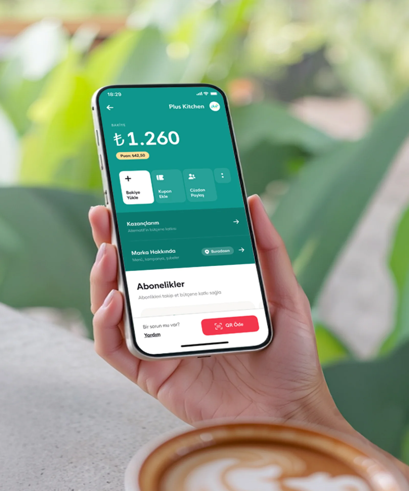
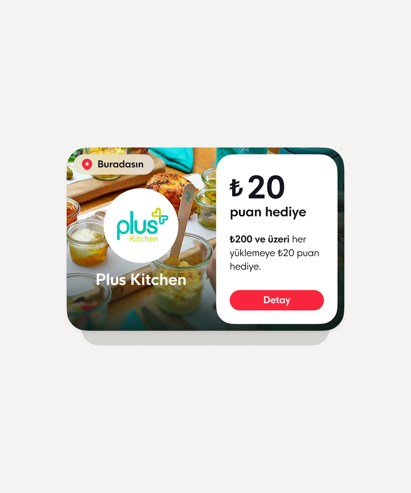
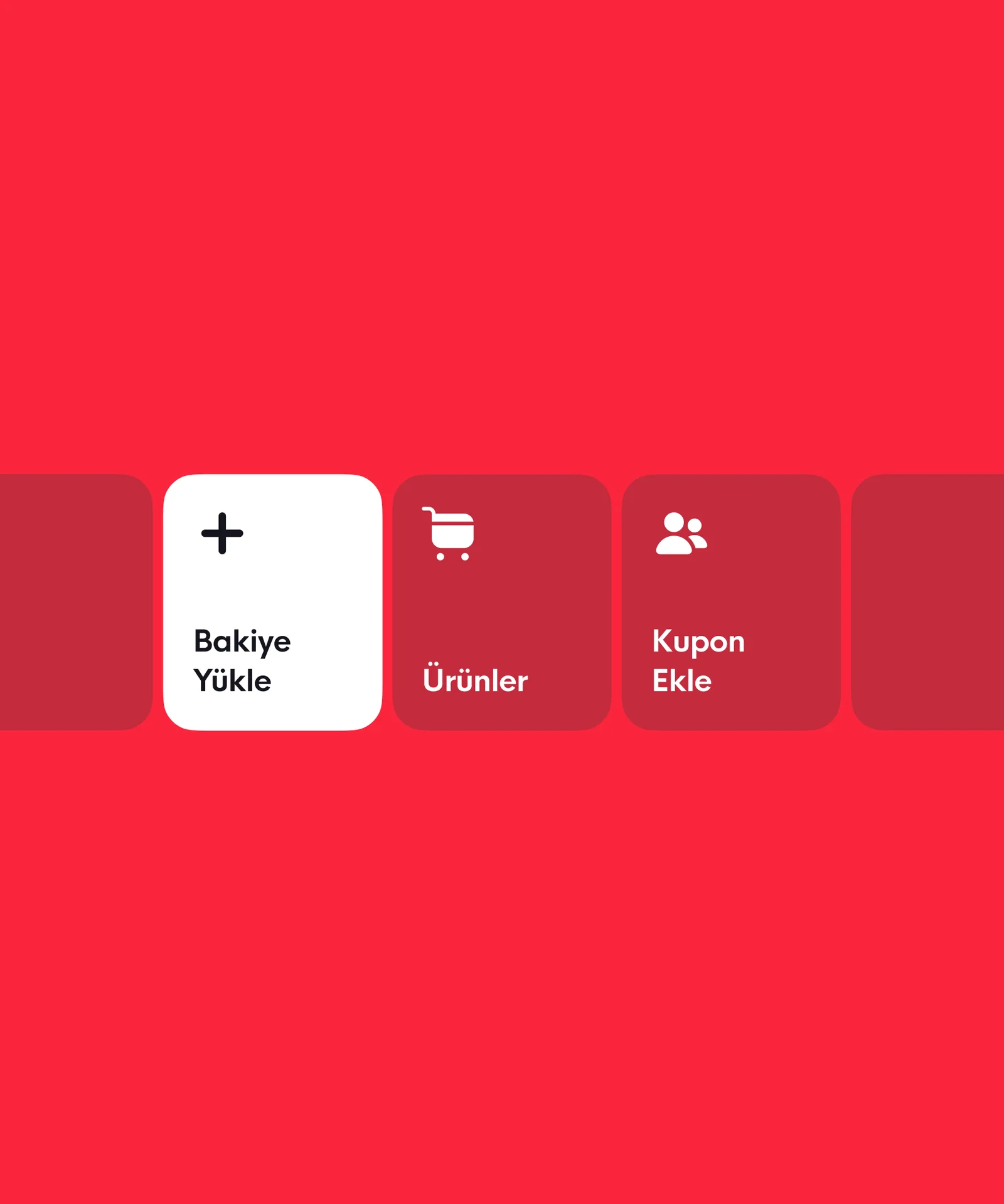
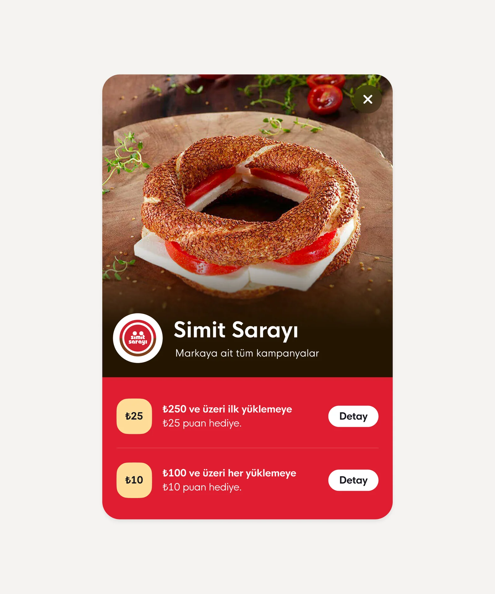
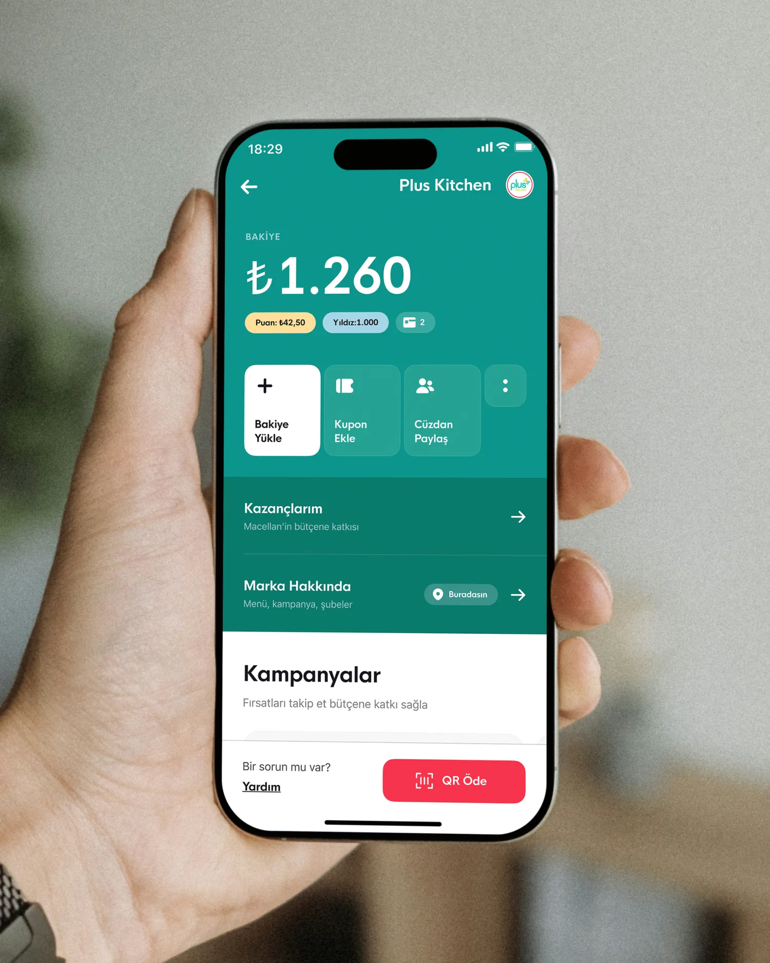
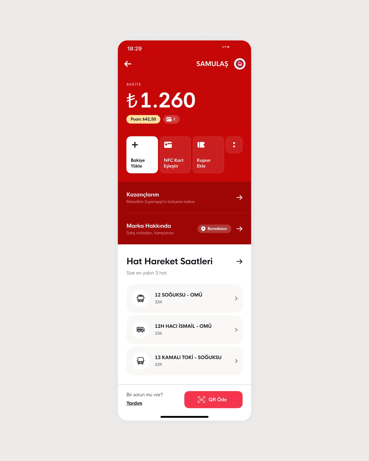
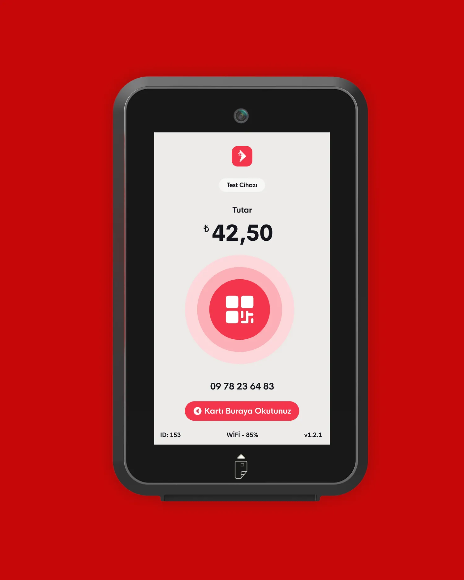
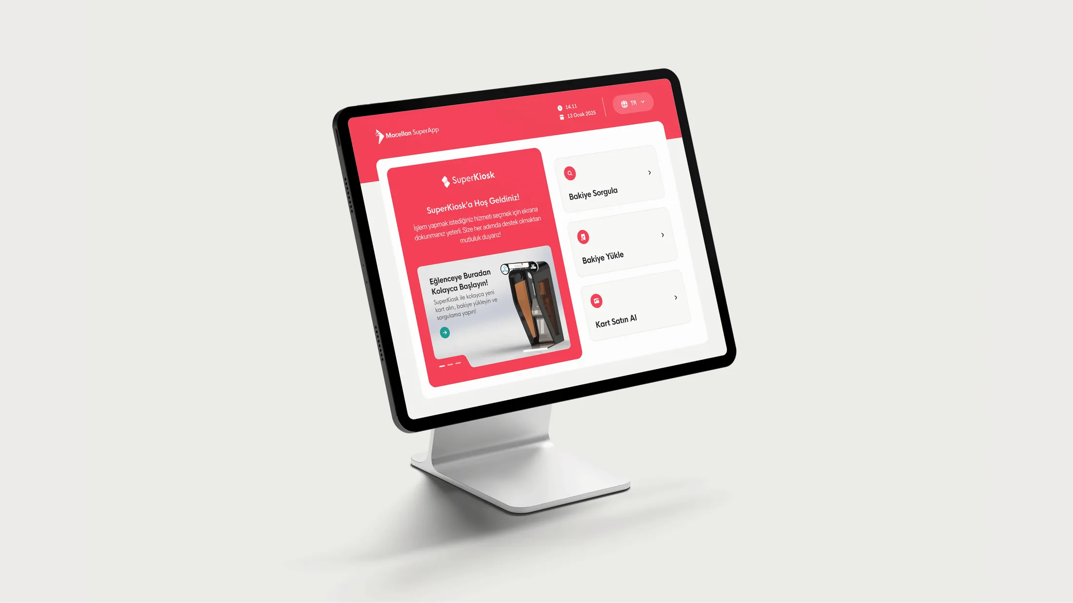
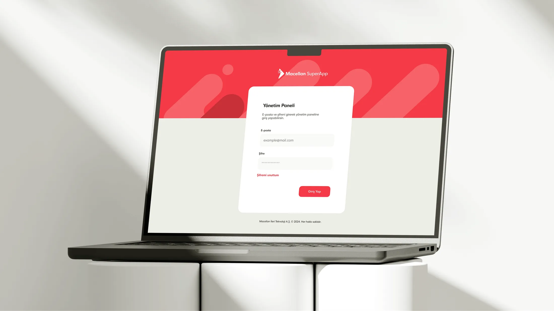
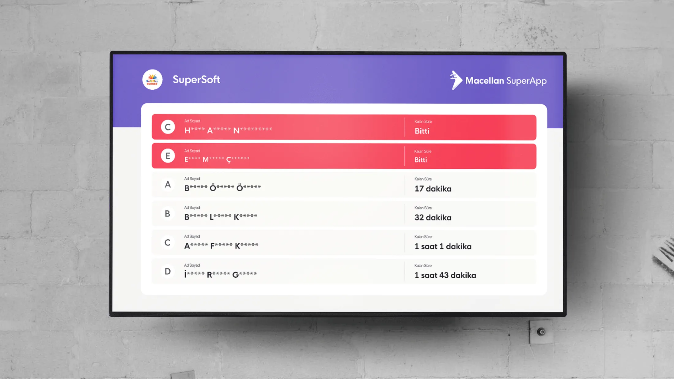
I played an active role in redesigning and shipping the V2 experience of Macellan SuperApp. V2 brought in-store payment, remote ordering, subscription packages, loyalty cards, soft-play, kiosk and field-device screens under one clearer, more scalable and reusable product structure.
- 01Live on the App Store and Google Play; the app has surpassed 1M+ users.
- 02Holds a 4.8 average store rating.
- 03V2 was built around reusable navigation, card, flow, service-module and state patterns.
- 04Scope grew from a 50+ page concept set to 440+ screens across mobile, kiosk and field devices.
The product was already live when I joined; my role was the V2 redesign and the design of its growing scope. I worked as the sole UI/UX designer on the product. I had a design lead early on; after they left, the design responsibility largely moved to me. A teammate supported graphic design. Early UX support came from the agency Wlitz; user testing was conducted and a 50+ page initial concept set was created for V2. From there, the scope grew to 440+ screens, and I owned their production, variations, states and developer handoff, working with product owners, mobile engineering, backend, marketing and operations.
Key product decisions
- 01Anchor the home around wallet visibility and the most-used actions.
- 02Keep high-frequency actions such as balance, payment and top-up close to the surface.
- 03Place loyalty, subscriptions, remote ordering and other services in a predictable hierarchy.
- 04Treat services as modules of one system, not as one-off screens.
- 05Carry one consistent product language across mobile, kiosk and field devices.
- 06Design the home and flows so new services can be added without breaking the structure.
Flow and system design
The structure separates fast actions from service discovery. Balance, payment and top-up stay close to the user, while loyalty, subscriptions, remote ordering and other modules sit in a clearer hierarchy. The same logic extends to kiosk and field-device screens, helping the product stay consistent across touchpoints.
Interface system
The interface system spans wallet cards, service tiles, list rows, campaign/module blocks, confirmation screens, status components, kiosk and device screens. Shared spacing, type, card, list and state rules keep iOS, Android and field-device surfaces aligned under the same product language.
Edge cases & states
- 01Empty wallet, pending top-up and failed payment states.
- 02Loyalty tier changes and subscription renewal / expiration states.
- 03First-time users versus users with many active services.
- 04Long service names and localisation needs.
- 05Kiosk use and transaction states on field-device screens.
Developer handoff
I delivered the home architecture, multi-service flows, reusable mobile patterns, kiosk and field-device screens with state annotations. The handoff explained how modules enter the system, how actions remain reachable and how each surface keeps the same interaction rhythm.
What I'd improve next
I would add a light personalisation layer so the home can respond to real usage without becoming unpredictable. I would also tighten cross-service navigation so moving between wallet, loyalty and subscriptions feels more continuous.