Tiko Sanal POS Dashboard
Tiko is a virtual POS product where merchants need to read and reconcile payment activity every day. The dashboard had to make account health visible quickly, while still allowing operators to inspect a single transaction, understand its lifecycle and act on its current state.
- (Context)
- Figensoft · Virtual POS / merchant dashboard
- (Role)
- Senior UI/UX Designer — UX architecture, UI design, dashboard flows and handoff
- (Scope)
- Dashboard structure, transaction list, filters, status logic, detail panel, settlement/refund states, component patterns and developer handoff
- (Platform)
- Web dashboard / merchant backoffice
- (Status)
- Professional work
- (Live product)
- Open live dashboard

The problem
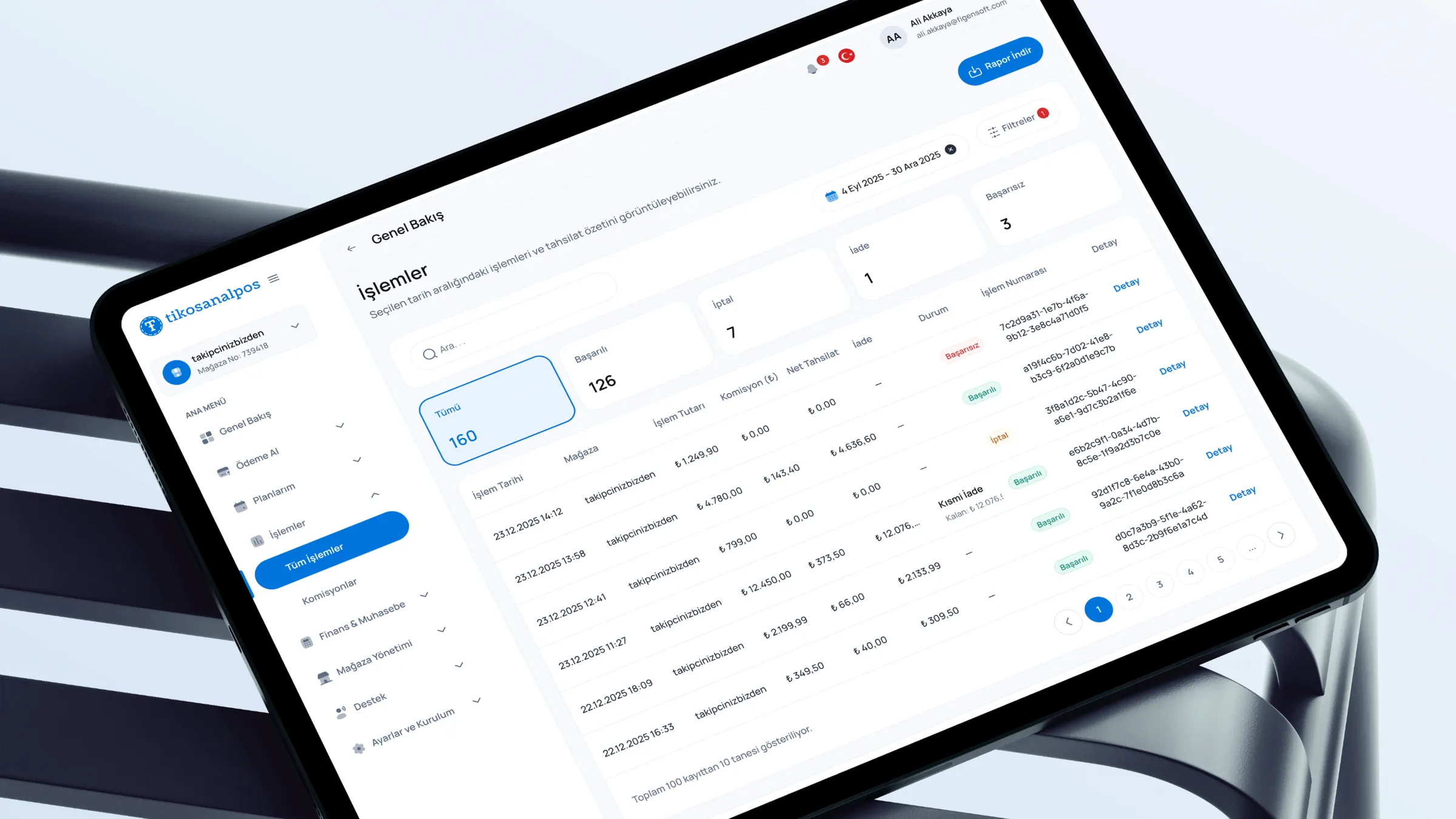
Merchant dashboards carry dense operational information, but operators still need speed. They move between summaries, filters, transaction rows and detail states while trying to keep context. The main tension was holding overview and detail together: the account needs to be readable at a glance, but each row may still require investigation.
Sole designer on the product, working closely with two front-end and three back-end engineers plus product stakeholders. I owned the dashboard end-to-end — needs analysis, flows, IA, screens and Figma handoff — and adapted dense financial screens to real backend data constraints, then folded weekly post-launch feedback back into the design.
Key product decisions
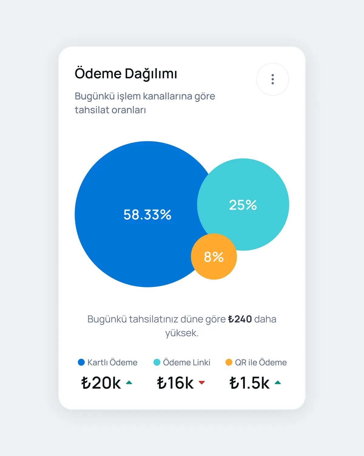
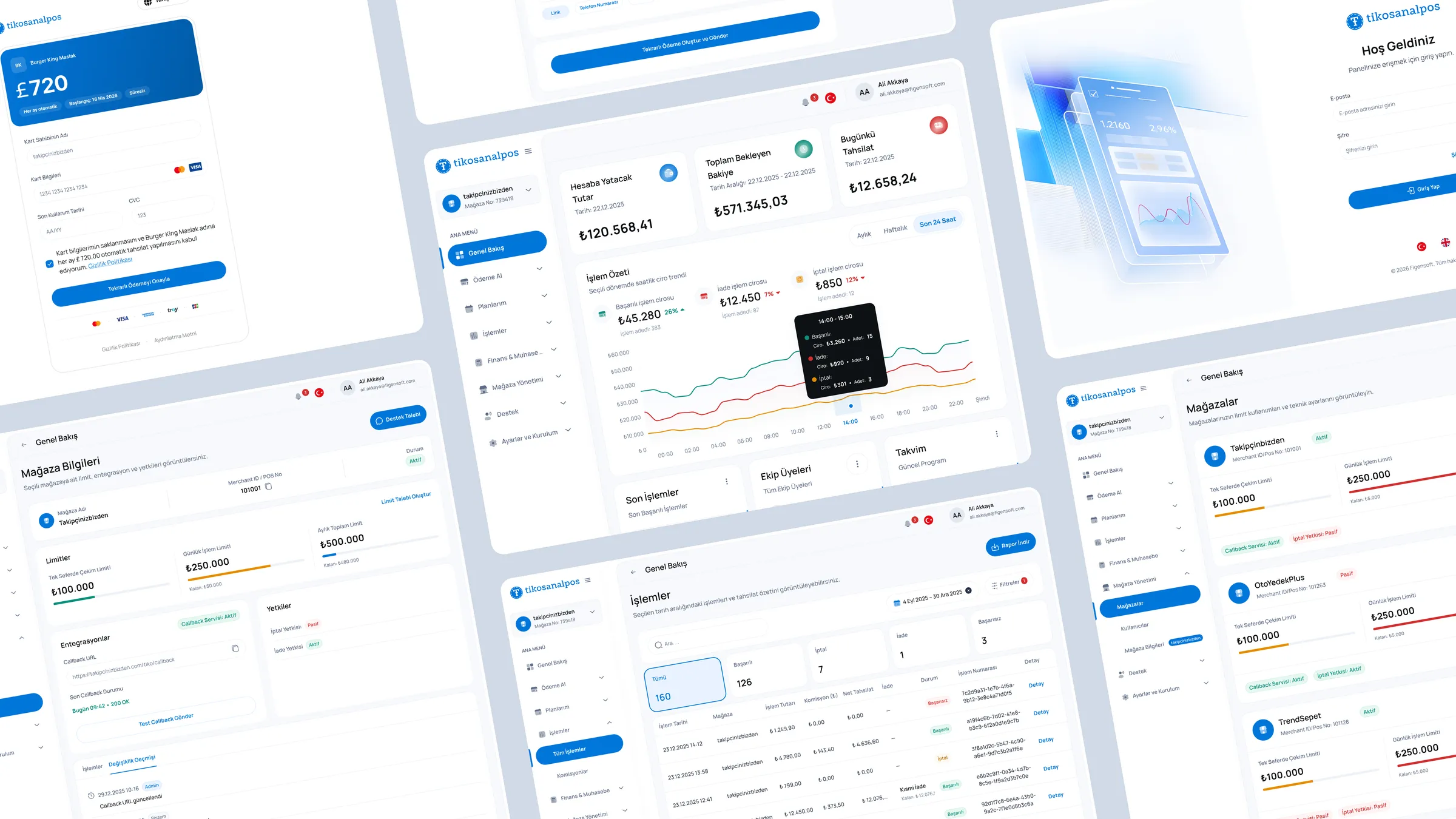
- 01Lead with operational summary cards so account state is visible before the user enters the table.
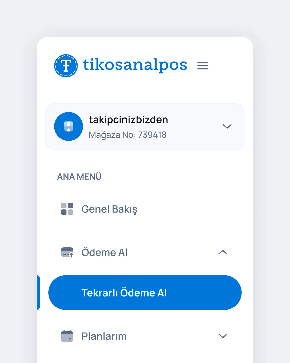
- 02Keep filters, status and transaction search close to the table instead of hiding them in secondary controls.
- 03Use a persistent detail panel so operators can inspect a transaction without losing their list context.
- 04Define one status language across summary cards, table rows, badges and detail states.
Flow and system design
The dashboard is built around a daily operations loop: scan the account, filter the list, inspect a transaction and resolve a state. Filters, table selection and the detail panel share the same model, so every action keeps the user oriented. Settlement and refund behaviour are treated as transaction states rather than separate destinations.
Interface system
The interface system is compact and operational: KPI cards, filter chips, dense tables, status badges and a right-side detail panel. Components share spacing, type and state rules so the dashboard stays stable under dense data. Hover, selected, loading, empty and filtered-to-zero states are defined to keep the product usable in real backoffice conditions.
Edge cases & states
- 01Settling, settled, refunded, partially refunded and failed-capture states across list and detail.
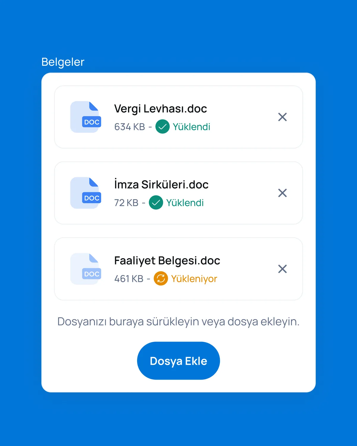
- 02Empty, loading and filtered-to-zero states for the transaction table.
- 03Terminal offline or degraded health before it blocks a sale.
- 04Long merchant names, large amounts and multi-currency formatting without breaking the grid.
Developer handoff
I delivered annotated flows, dashboard structure and component states for engineering implementation. The handoff included status logic, table behaviour, detail-panel structure and state definitions so settlement and refund behaviour could be implemented without interpretation gaps. It runs in production as Tiko's virtual-POS merchant dashboard.
A merchant-facing dashboard for reading payment activity, refunds, settlements and operational states without losing the transaction-level detail teams need during daily work.
(08)

From transaction complexity to clearer merchant operations
The work reorganizes payment activity, refunds, settlements, transaction status and reporting into a clearer merchant dashboard structure.
Payments / POSWhat I'd improve next
I would add saved views for recurring operator tasks and explore bulk actions for power users. I would also design a lightweight reconciliation mode that connects settlements to payouts directly inside the list.
A merchant-facing virtual POS dashboard that pulls transaction summaries, payment status and operational actions into one clearer, self-service surface — designed to cut manual follow-up and make high-frequency financial operations easy to scan and act on.
- 01Refunds, settlement and reconciliation were surfaced inside the dashboard to reduce reliance on manual, support-led follow-up.
- 02Information architecture reorganised around what merchants check most — daily summary, transaction status, currency totals and recent activity.
- 03Built on the existing component system, so the screens handed off cleanly to front-end.