Posta Güvercini Website
A corporate website for Posta Güvercini — a long-established Turkish bulk-messaging brand — bringing many services (bulk SMS / MMS / email, OTP, permission-based marketing, mobile surveys) out of a previous structure that was hard to scan — stock imagery, dense content blocks and weak hierarchy — into one readable, trust-building web system. Built solo and from scratch as a system of reusable sections, not one-off pages — one that holds up as the product grows.
- (Role)
- Senior UI/UX Designer — solo, end-to-end
- (Duration)
- 1 month
- (Year)
- 2026
- (Scope)
- 23-page corporate website (10 product/service pages, 4 legal pages)
- (Platform)
- Responsive web (desktop + mobile)

What was designed
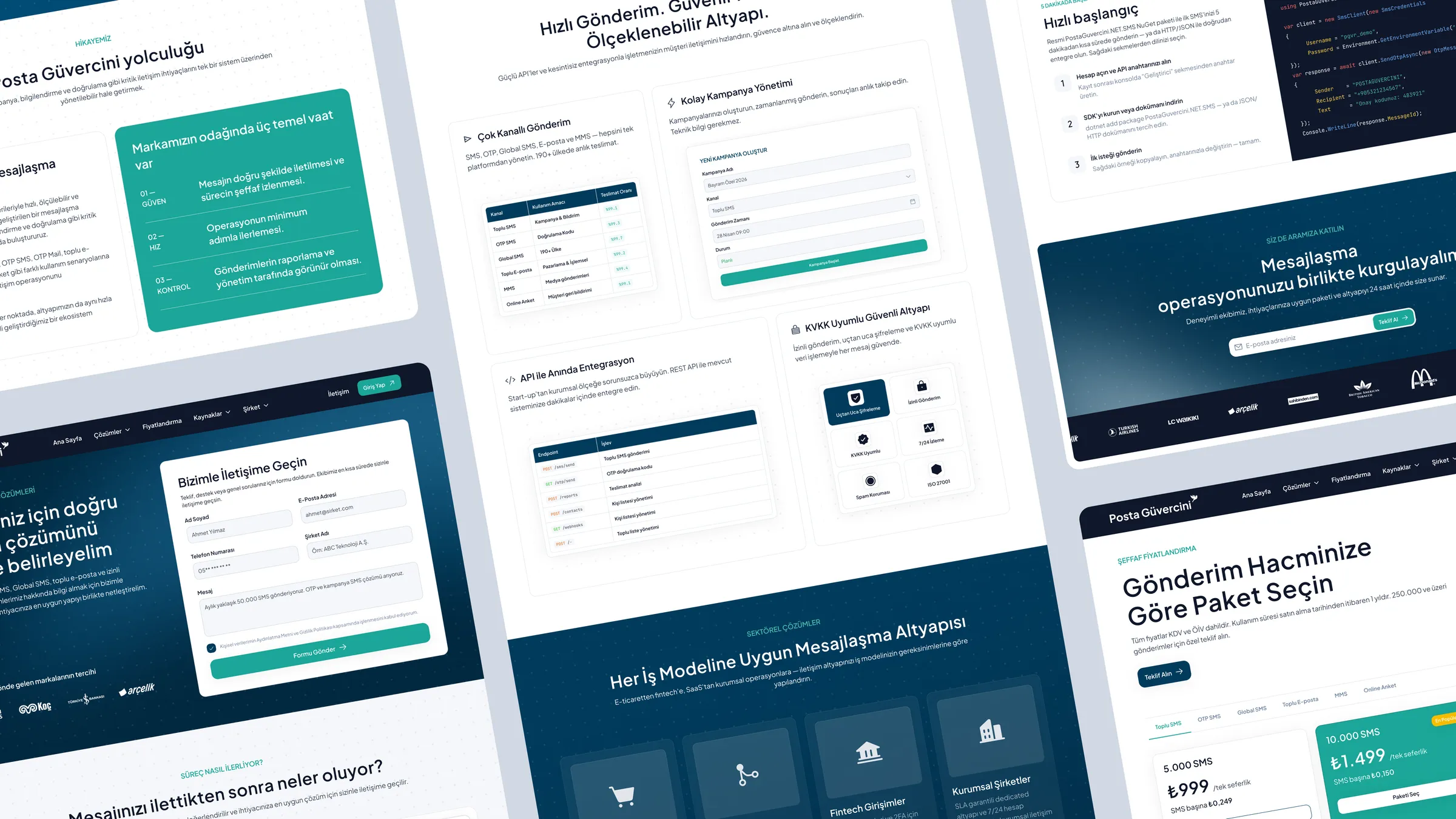
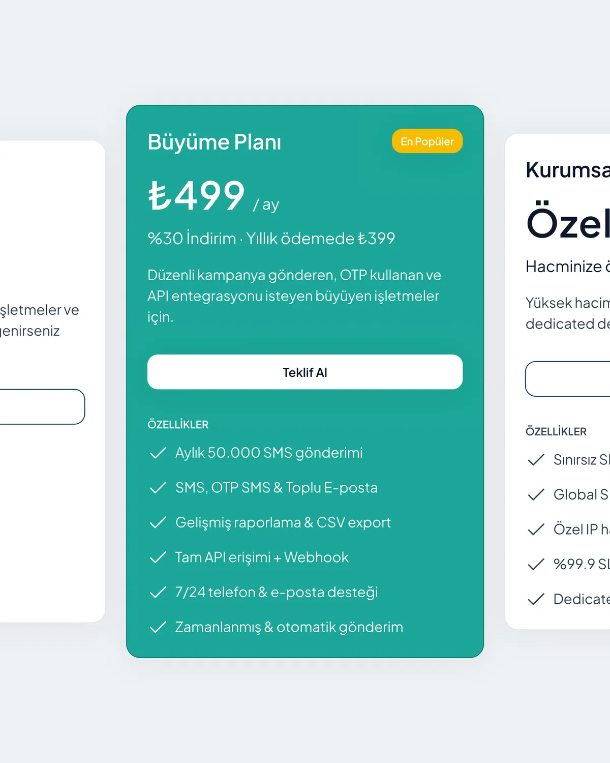
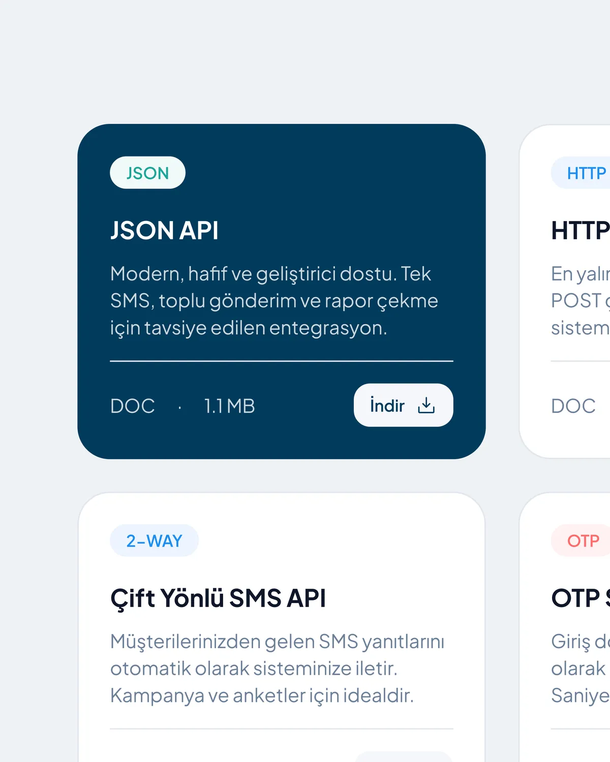
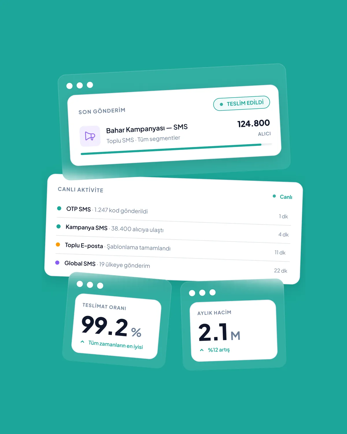
I built the site's information architecture, service communication and visual hierarchy from scratch. The core challenge: keeping a multi-service product — bulk SMS / MMS / email, OTP, Global SMS, permission-based marketing and mobile surveys — clear and consistent across responsive layouts. I grouped the services into a clear Products / Solutions structure, moved away from the legacy site's cyan + stock-photo language to a Posta Güvercini-specific deep-navy + teal visual system, and designed reusable section components for the web.
System value
A reusable section system gives the brand a clearer way to tell its services across screen sizes, and to add or change pages over time. Consistency lives in shared components and tokens, not in individual pages — so the site is infrastructure that can grow, not the design of a single moment.
From dense product explanation to clear service communication
The previous structure made services hard to scan quickly — stock imagery, dense content blocks and weak hierarchy. The new system carries the same content with stronger information architecture, clearer navigation and a consistent corporate voice — surfacing proof like "15,000+ corporate customers" to make trust visible.


A corporate website for Posta Güvercini — a long-established Turkish bulk-messaging brand — bringing many services (bulk SMS / MMS / email, OTP, permission-based marketing, mobile surveys) out of a previous structure that was hard to scan — stock imagery, dense content blocks and weak hierarchy — into one readable, trust-building web system. Built solo and from scratch as a system of reusable sections, not one-off pages — one that holds up as the product grows.
(07)

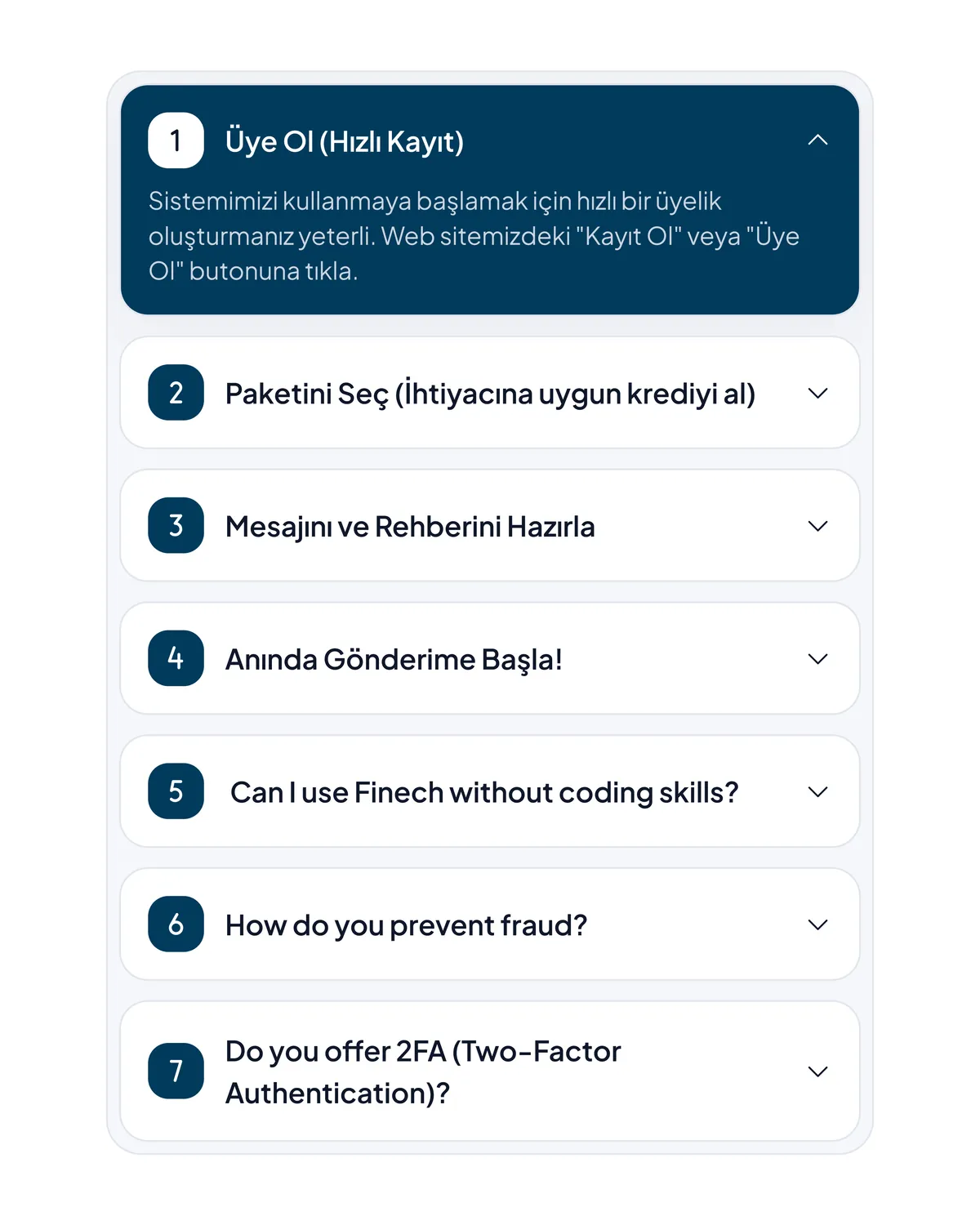
- 01Reduced a multi-service product to a simple information architecture — 10 product/service pages grouped under Products / Solutions (Bulk, OTP, permission-based, Mobile Survey).
- 02A section-based responsive system — reusable modules across breakpoints, not one-off pages (every page in desktop + mobile).
- 03Dropped the legacy cyan + stock-photo language for a Posta Güvercini-specific navy + teal system; surfaced proof like "15,000+ corporate customers" through hierarchy.
The new site is live — designed solo, from scratch, in about a month, then handed off to development.
- 01Post-launch feedback indicated clearer service communication and a more understandable inquiry flow.
- 02The new structure made product/service pages easier to maintain and easier for visitors to scan.
- 03The entire site — 10 product/service pages plus legal pages — is produced from a single reusable section system.
Final note
A corporate website designed as a system of reusable sections, not one-off pages — staying consistent as the product grows.