Tiko Digital Wallet & Meal Benefits Ecosystem
Tiko is a consumer wallet and benefits product where users need to understand what they can do with their balance, where they can use it and which offers are available around them. The work focused on making Tiko more useful beyond a static wallet view by connecting balance, member-business discovery, campaigns, map-based exploration and meal-benefit flows into one clearer product structure.
The broader Tiko Yemek work extended this thinking into a multi-sided ecosystem: employees need a fast way to use their meal balance, employers need to distribute and track benefits, and businesses need a simple way to accept and verify payments. The design challenge was to keep the consumer experience lightweight while still supporting the operational needs behind it.
- (Context)
- Figensoft · Consumer wallet, offers, member-business discovery and meal-benefit ecosystem
- (Role)
- Senior UI/UX Designer — UX strategy, product architecture, UI design, information architecture and design handoff
- (Scope)
- Consumer app surfaces, wallet balance, offers, member-business discovery, map/list flows, campaign detail, meal-benefit strategy, employee app architecture, employer panel architecture, business-side payment acceptance flows, QR/code payment states and design handoff
- (Platform)
- Mobile app / web panel / multi-sided service ecosystem
- (Status)
- Professional work
- (Live product)
- View on App Store


The problem
A wallet product can easily become a passive balance screen if users cannot quickly understand where to use it, what value it gives them and what to do next. Tiko needed to make accepted businesses, nearby locations, campaigns and payment actions more visible without overcrowding the main experience.
For Tiko Yemek, the problem was broader: the product was not just a food-ordering flow or a simple digital card. It needed to support a full benefit lifecycle across employees, employers and businesses. The main challenge was defining a focused V1 that solved the daily loop first: check balance, find a valid place, pay quickly, confirm the result and track usage.
A digital wallet and meal-benefits ecosystem where users can check their balance, discover where Tiko is accepted, explore offers, pay with QR/code and track activity across a clearer daily-use experience.
(06)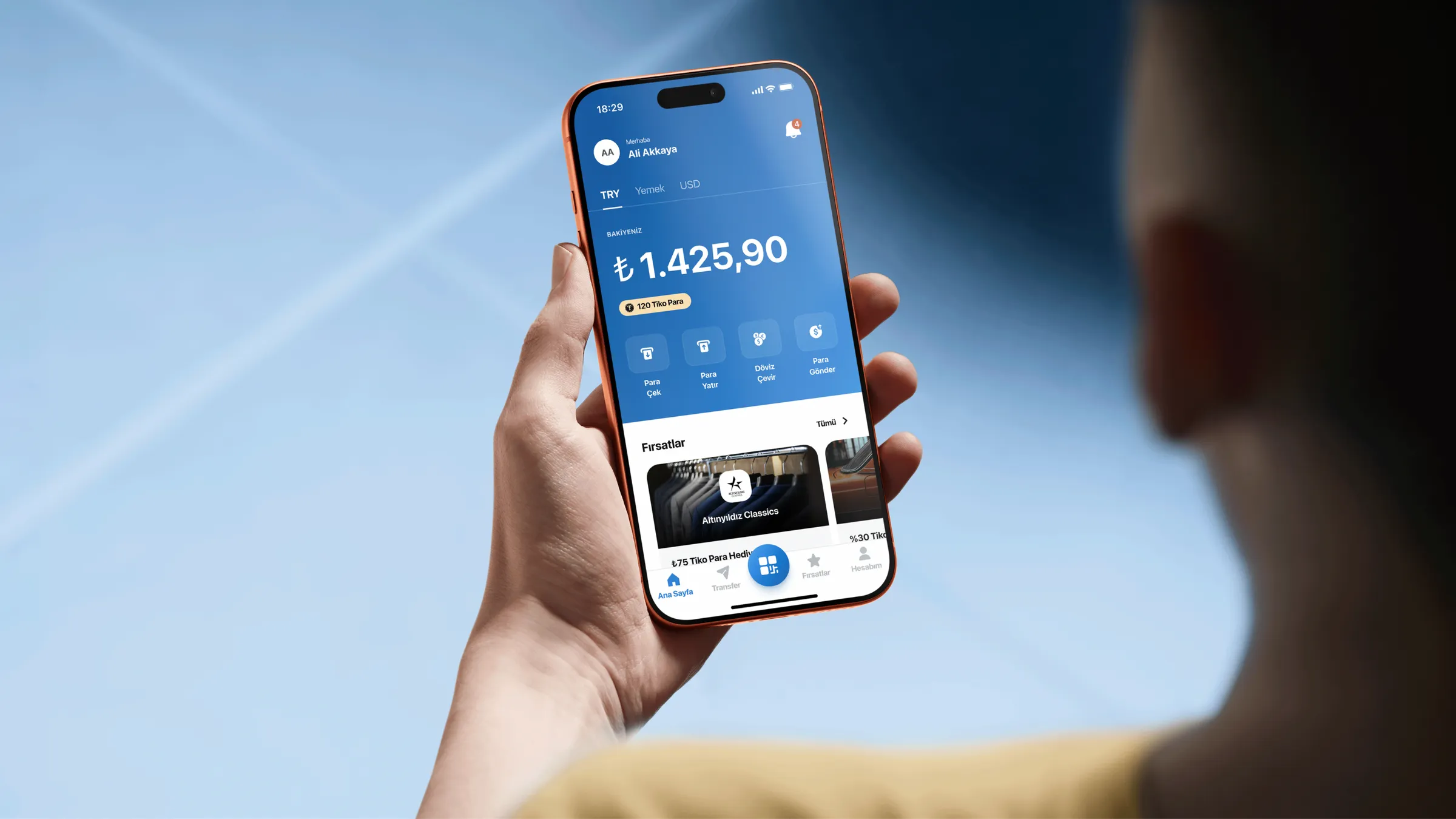
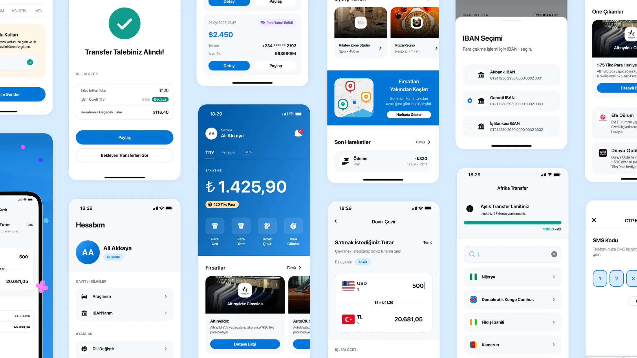
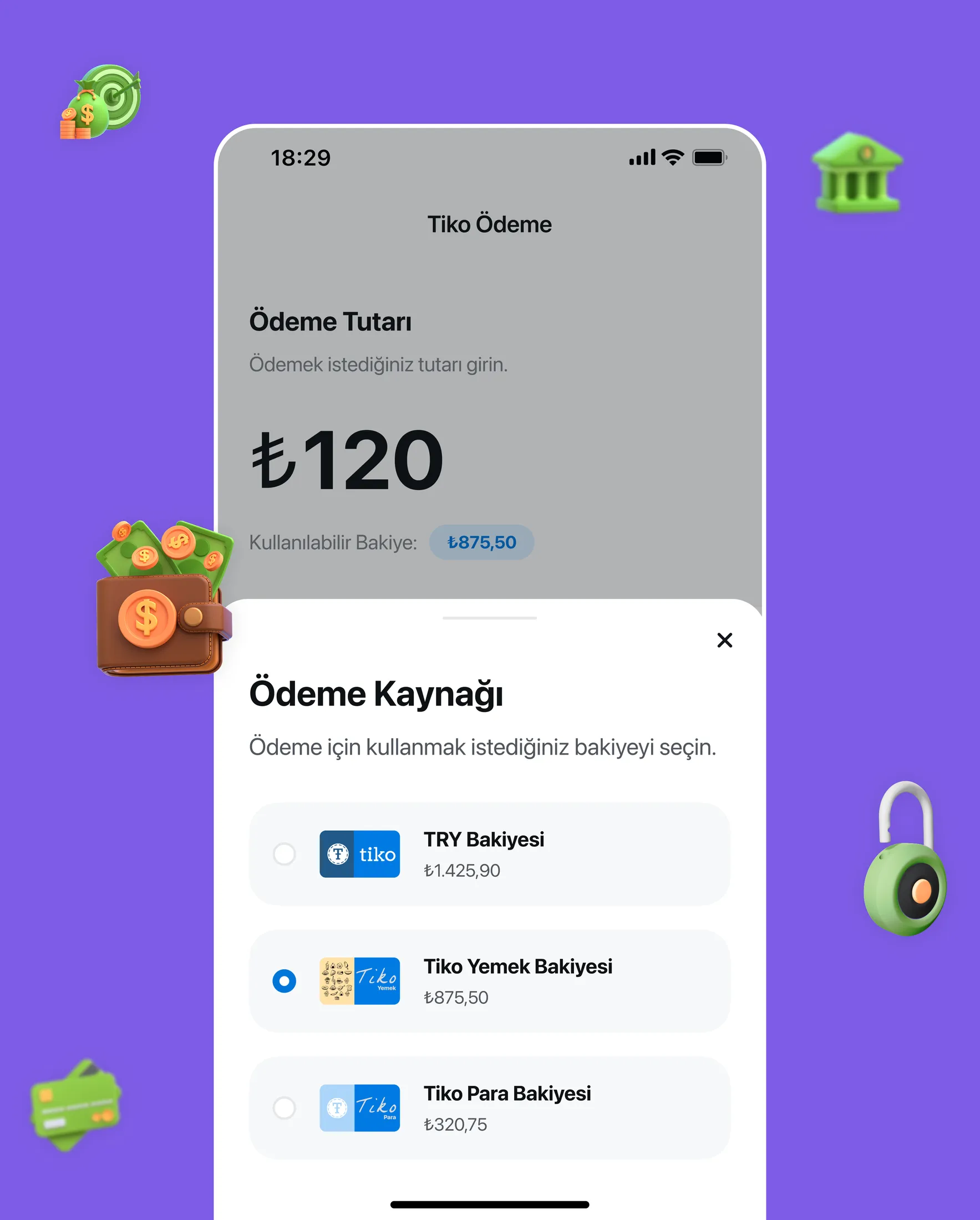
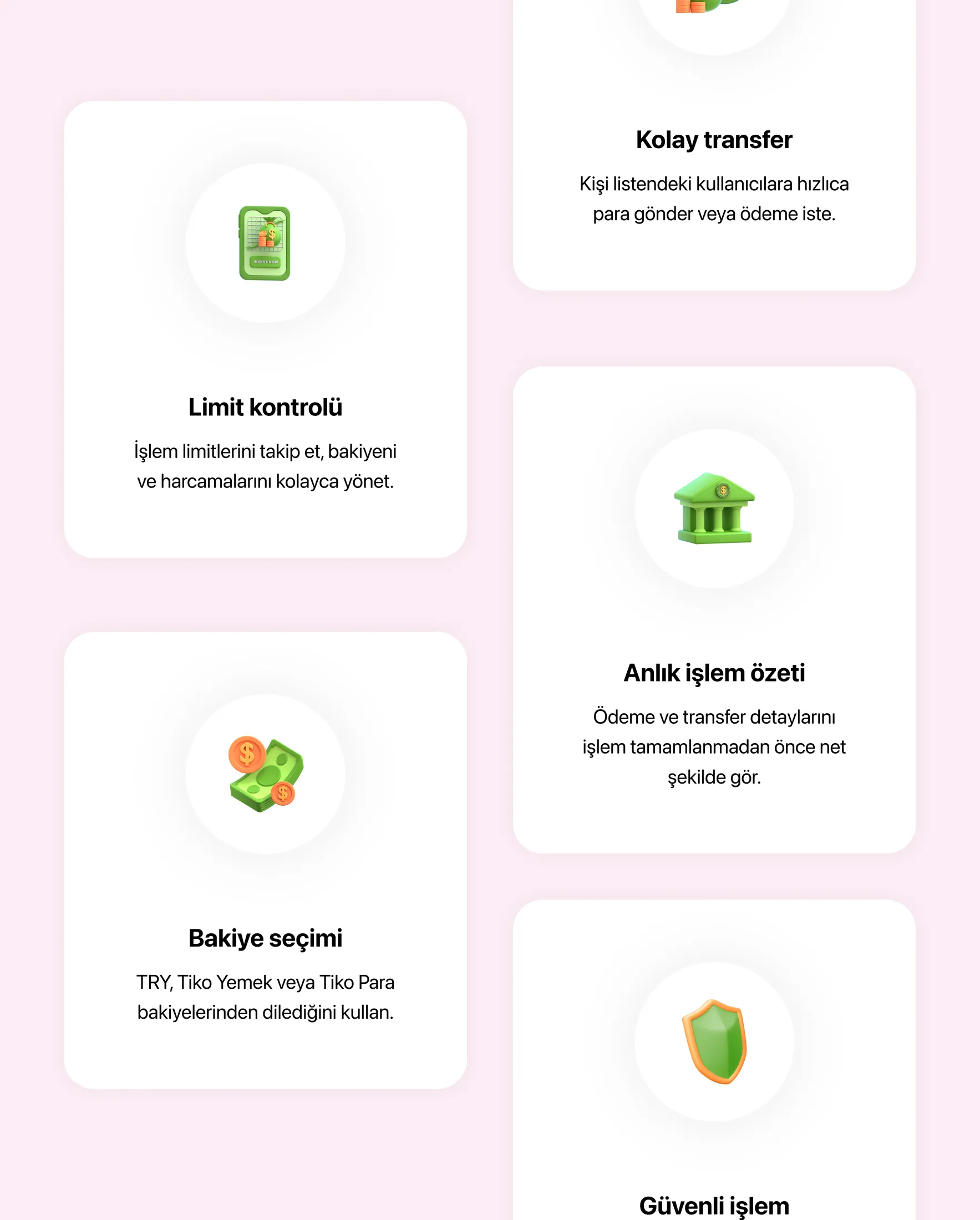
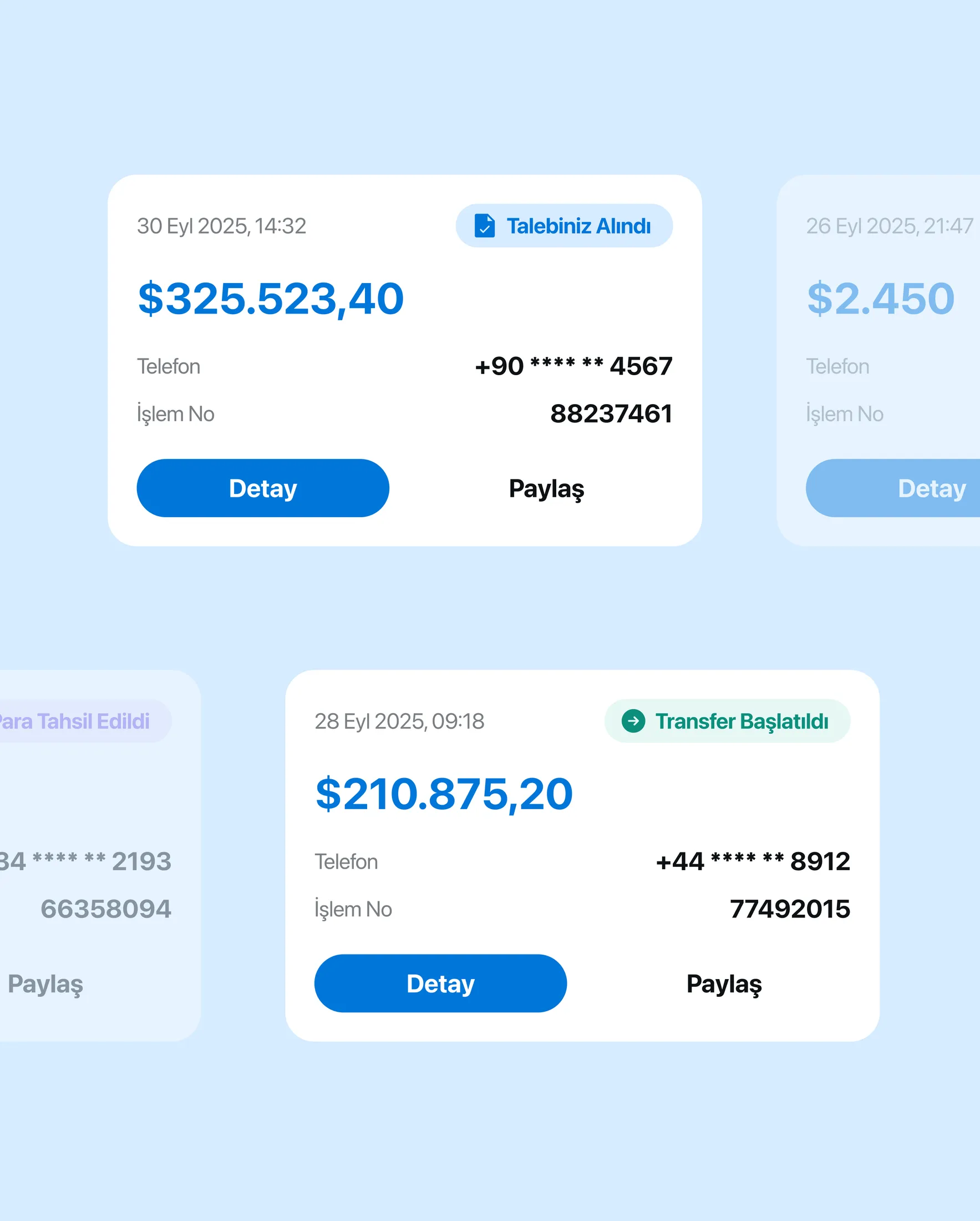
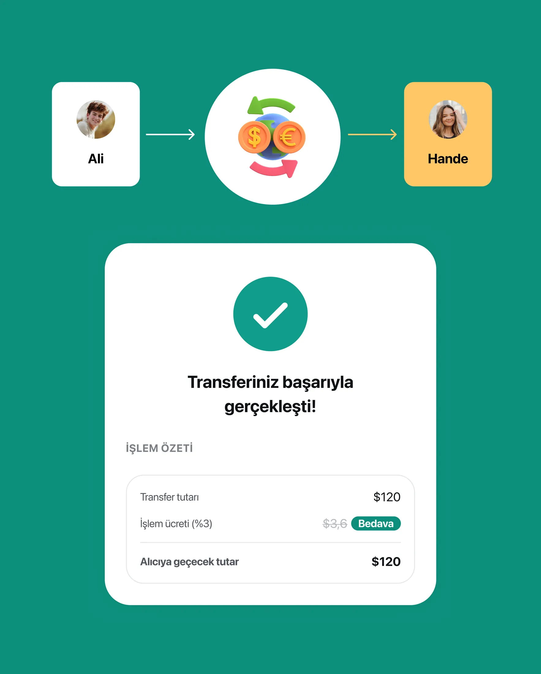
A Tiko experience designed to move beyond passive balance checking by making usage, discovery, offers and meal-benefit flows more visible, connected and actionable.
- 01Member businesses and offers were brought into the core consumer experience, helping users understand where Tiko can be used and what value is available.
- 02Map, list, category and detail flows made the discovery experience more concrete and usable for real-world decisions.
- 03Tiko Yemek was framed as a focused digital meal-wallet ecosystem rather than a generic food product.
- 04The V1 scope was reduced to the most important daily loop: balance, valid location, QR/code payment, transaction result and support.
- 05The product architecture connected employee, employer and business needs without forcing all complexity into the consumer app.
- 06Country-specific considerations for KKTC and Azerbaijan were reflected in the payment model and launch strategy.
I worked as the designer responsible for shaping the Tiko consumer surfaces and Tiko Yemek product direction within Figensoft. My role covered UX strategy, information architecture, product flow definition, UI direction, visual polish and design handoff.
I collaborated with product and engineering stakeholders while translating business requirements into user-facing flows. The work required balancing consumer simplicity with operational needs such as employer management, benefit distribution, business-side verification and transaction tracking.
Key product decisions
- 01Lead the consumer experience with balance visibility and clear next actions.
- 02Keep Offers and Member Businesses as distinct discovery areas instead of hiding them behind a generic tab.
- 03Use list, category and map-based discovery to answer the user's core question: “Where can I use Tiko?”
- 04Treat campaigns and Tiko Para as a value layer that supports usage without distracting from payment and balance clarity.
- 05Define Tiko Yemek as a digital meal wallet, not a food-delivery product.
- 06Model the product as a three-sided ecosystem: employee, employer and business.
- 07Keep V1 focused on balance, valid locations, QR/code payment, transaction tracking and support.
- 08Leave heavier loyalty, recommendations, multi-wallet behaviour and advanced campaign mechanics for later phases.
Flow and system design
The consumer experience is built around a simple daily loop: check balance, discover where Tiko is accepted, review an offer or business detail, go to the location, pay with QR/code and confirm the transaction result. Offers, member businesses and map/list views work as connected entry points into the same usage journey rather than separate content areas.
For Tiko Yemek, the system expands into three connected flows. Employees use the mobile app to view meal balance, find restaurants, pay and track spending. Employers manage people, budgets, balance distribution, usage reports and invoices. Businesses verify QR/code payments, complete transactions and follow daily activity. The product architecture keeps these flows separate enough for clarity but connected through the same balance, payment and transaction logic.
Interface system
The interface system is mobile-first, card-based and designed for fast scanning. Balance modules, quick actions, offer cards, member-business cards, category filters, map/list views and detail pages use clear hierarchy so users can understand the next action without reading too much.
For the meal-benefit ecosystem, the interface language prioritises speed and confidence at the moment of payment. QR/code screens, payment result states, insufficient balance messages, transaction details and support entries were structured to reduce hesitation in a real cashier-facing moment. Employer and business-side surfaces were kept more operational, with dashboard-like information architecture, lists, reports and clear status language.
Edge cases & states
- 01No nearby accepted businesses or restaurants.
- 02Offer expired, not yet active or no longer available.
- 03Business detail with long names, multiple branches or incomplete location information.
- 04Map/list views with empty results after category or distance filtering.
- 05Insufficient balance before payment.
- 06QR/code expired, already used or not verified.
- 07Payment successful, failed, pending or reversed.
- 08Restaurant/business closed at the time of use.
- 09Multi-currency and country-specific launch requirements for KKTC and Azerbaijan.
- 10Employer-side empty employee list, bulk upload errors, no usage data and invoice/report unavailable states.
- 11Business-side daily activity with no transactions, failed verification or support-needed cases.
Developer handoff
I delivered product architecture, information architecture, screen structures, key user flows, state logic and visual direction for the Tiko consumer and meal-benefit experience. The handoff clarified how balance, discovery, offers, member businesses, map/list behaviour, QR/code payment and transaction states should work together.
The work also included strategy-level artifacts for Tiko Yemek, translating market and benchmark findings into a V1 product direction that could guide design and implementation. The focus was to make the ecosystem understandable for product stakeholders while keeping the future interface practical for engineering teams.
What I'd improve next
I would validate the QR/code payment flow with real employee and business-side scenarios, especially around cashier speed, error recovery and low-connectivity moments. I would also explore saved/favourite businesses, smarter nearby suggestions, clearer employer bulk actions and stronger reporting shortcuts once the V1 usage loop is stable.